Yeah, positioning multiple starships in a single image has never really been my strong point. Lighting is also an issue frequently.
I suggest treading carefully in this aspect. I've seen other people overthinking the ship angles and they tend to look awkward and lacking in finesse. I personally struggled with this in my earlier work, I guess I was trying to be "cool" or what-not. Yeah right - some of them look cringe worthy now.
For positioning, I guess its just trying to strike a balance between having a sense of movement and not being too over the top.
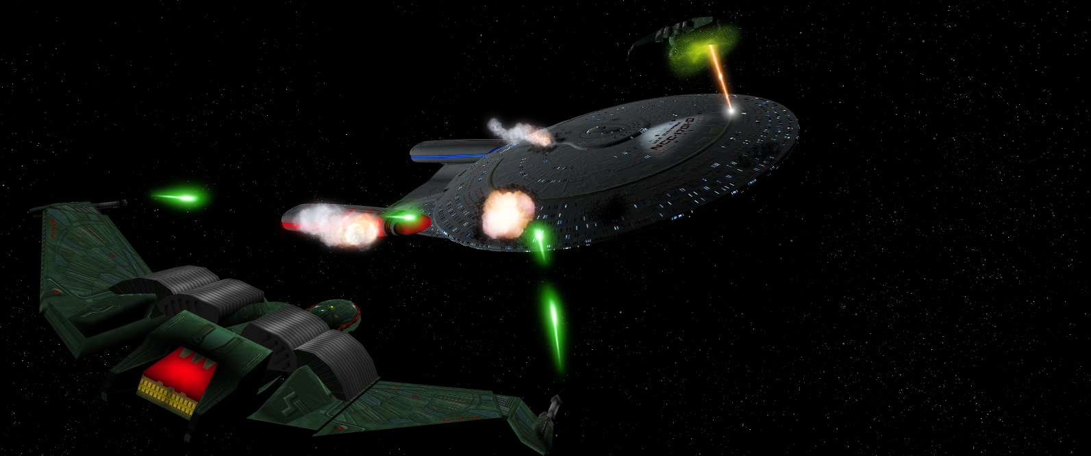
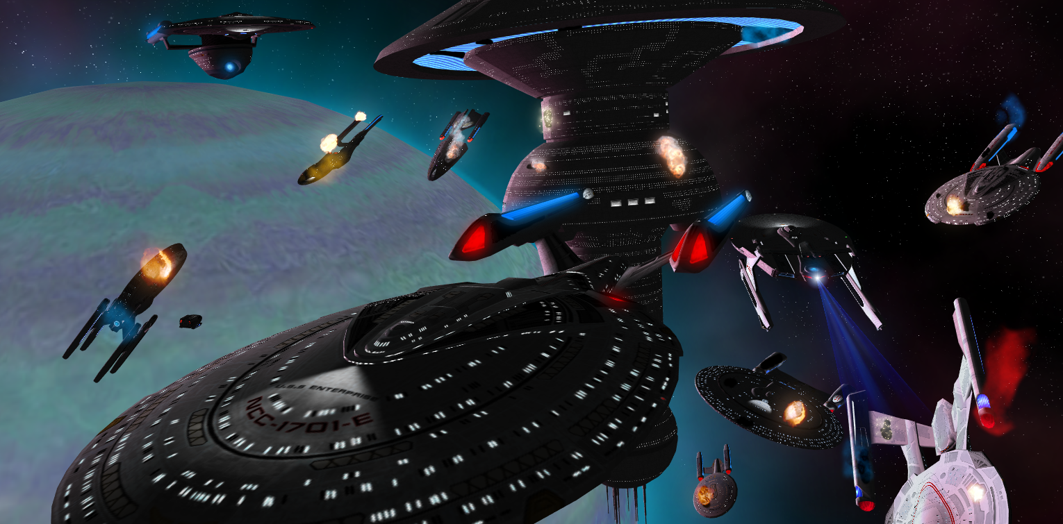
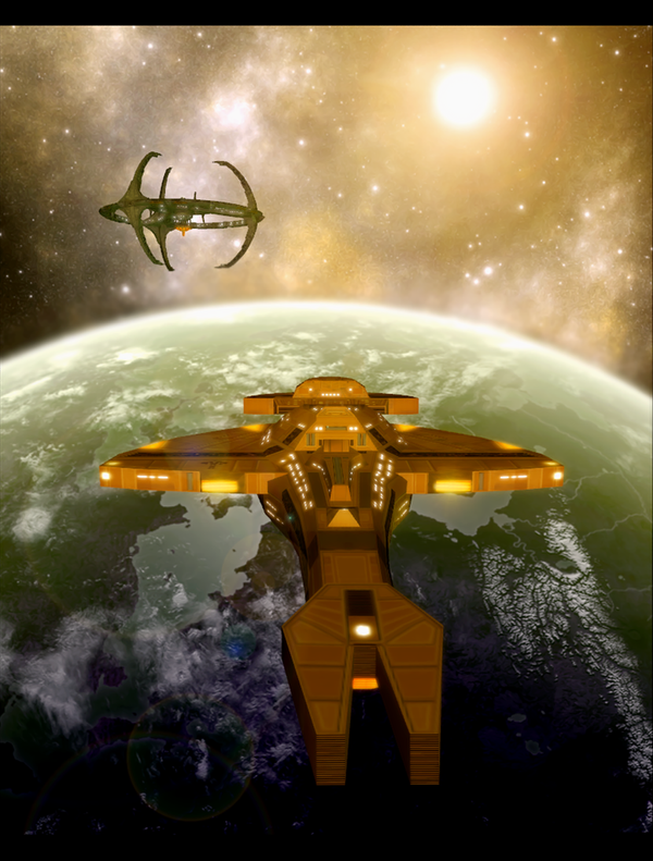
This is a good example from Dan1025, great use of the Nebula Class as the main subject, and complemented by her companions. The positioning and angles are just enough to accentuate a sense of motion, but still balanced by the overall direction of the ships to the right side. The rule of thirds also applies here, as the main subject is not cropped in an odd way.
---
Now lighting, this really can make or break the image. Use the directional light carefully and try not to make the colors too strong. Avoid flat neon colors and stick with a subdued palette. Take note of the background's key colors and look where the dominant light source comes from.
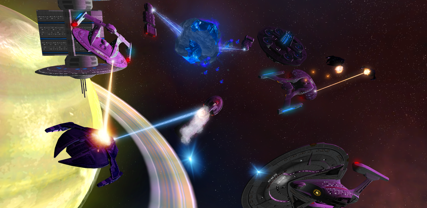
This won't come easy and there is trial and error involved. At times, I still get worked up on this aspect, trying to get the colors right is still a hit and miss situation. This is especially true if the shot has a lot of ships or there's too much stuff in the background image. If all else fails, I use Photoshop to edit specific parts to match everything else.
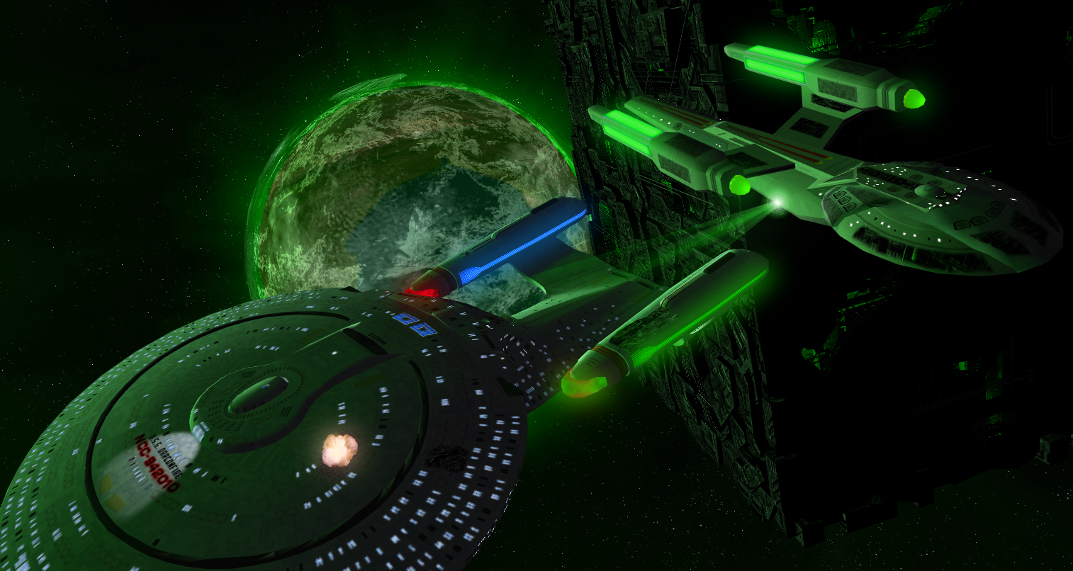
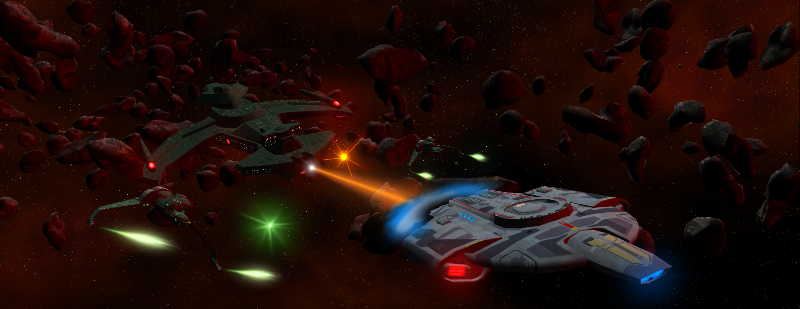
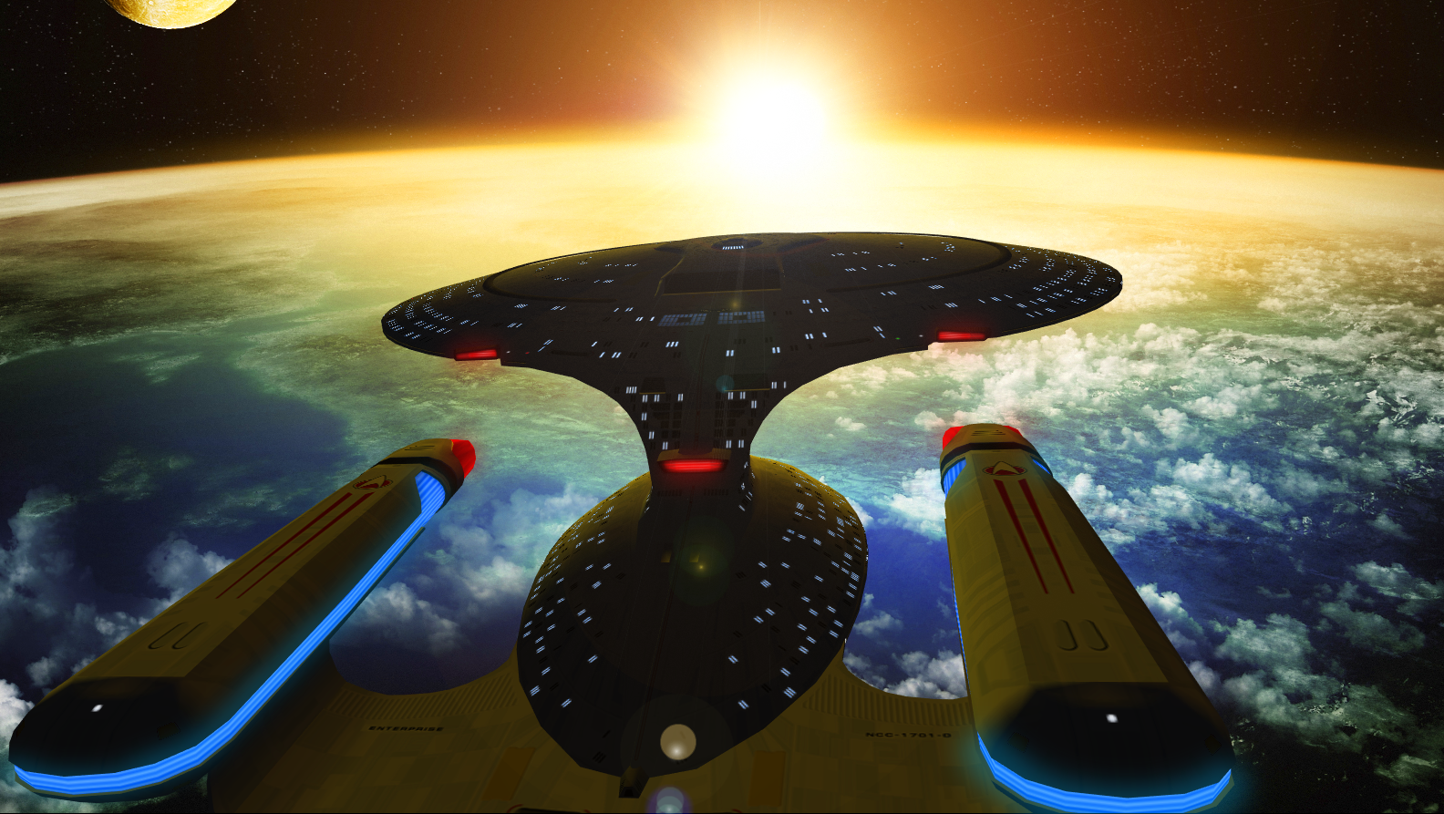
A simple shot of the Akira Class by me. The light source is clearly from the wormhole. Also note the surrounding Cerulean Nebula. I tried to use a pale blue light from the left side and complemented by a dark blue one from the right. With the correct mix, you get a decent result.
And don't get me started on using and trying not to use ingame items for the background. I've searched for better quality items, but then comes to process of conversions and such. Then I try to... ahem, "copy" you Jet, in the sense that you use actual images and such from various sources for backgrounds. I don't have a bloody clue how you do it though, lol.
Before I made the transition to using custom made backgrounds, I too relied on the in-game stuff for my art-works. As time went on, people started to criticize it. Basically, I had decent looking ships but the planets and stars didn't hold up anymore. Planets were too low poly, textures were sometimes bad as well. This was especially worse for planet close ups, where the detail could really be scrutinized.
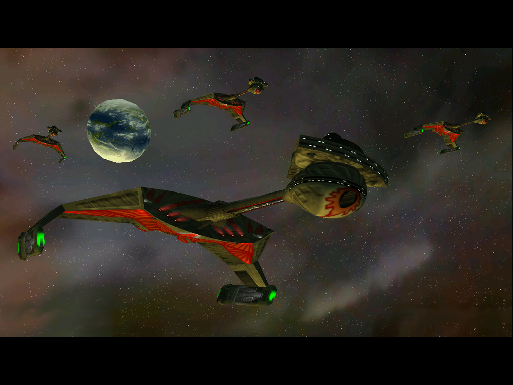
This an early one of mine, dating back to 2008, the stock planet doesn't really hold up anymore. Too jagged and you don't really feel the sense of distance - almost like an afterthought.
Being the close minded idiot that I was back then, I shrugged it off and gave some half-assed excuse of being in-game work and was somehow immune to their criticisms. That's all fine and dandy but people knew there was room for improvement. Indeed, I was really posting it as art, and was judged accordingly.
Over time a realization sunk in that if I really had to elevate my work into something better I had to listen to the folks who knew what they were doing. So I swallowed my pride and learned from my peers at DeviantArt.
It was at this stage where I was introduced to stock images. Basically ready to use fancy backgrounds for pic making - you just have to give credit of course.
---
I suppose the oldest trick in the book is simply pasting the background as an mbg file. Again, there is trial and error as the original image can get too stretched and warped. As expected, we go in-game load the background and the ships get positioned.
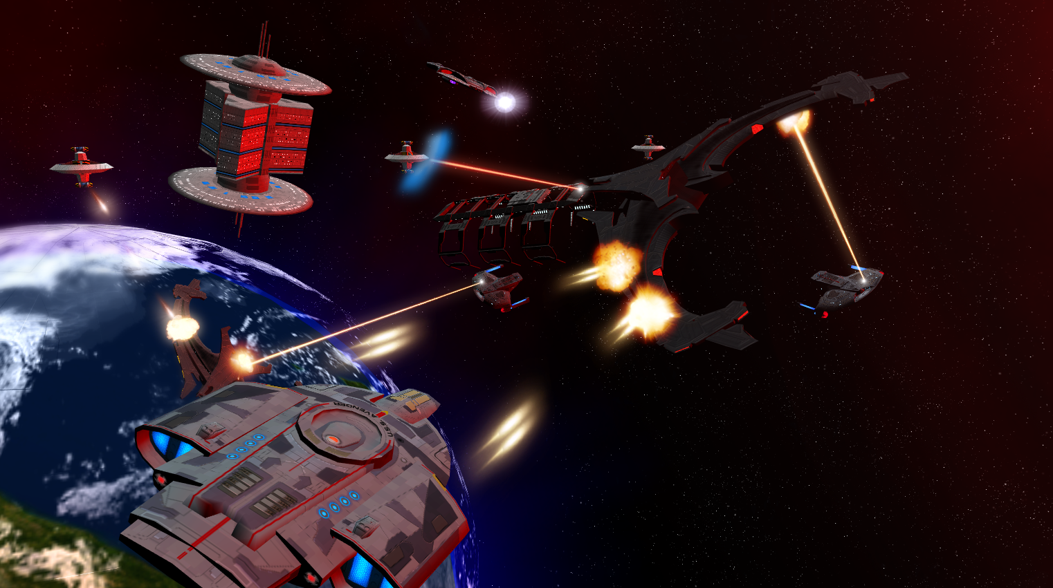
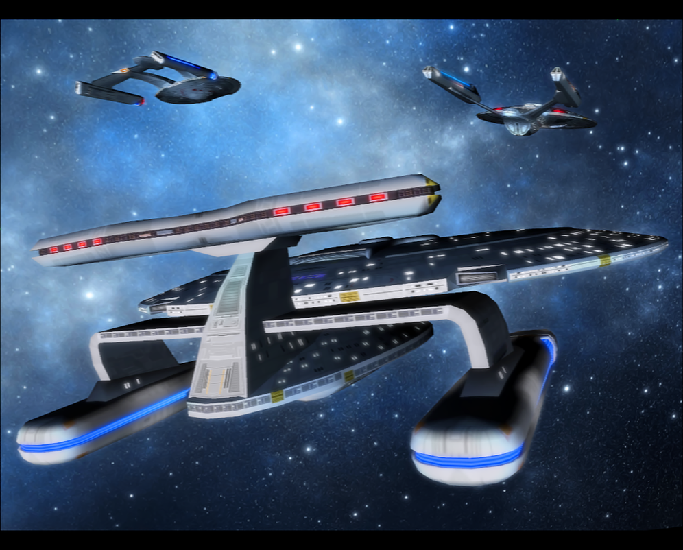
This is exemplified by Dan1025's attempt here. He used a custom mbgfile and off he went. Once again, great detail, the lighting and positions are spot on. Slightly blurring the background and the station is a subtle but clever touch - which implies much needed distance.
I've tried a method of "green-screening" ships onto the backgrounds in PS, but if I don't get the lighting just right, or some of the green stays uncut (both frequent occurrences), you can clearly tell they're very much pasted on. Some day you gotta teach me man

.
I've personally made several attempts at this "greenscreen" method. I take an image of a ship against a blank background (preferably black not green).
The" cutting" part still gets to me though. My last try was cutting the ship pixel by pixel and into the last detail using the polygonal lasso tool but its just too much work, and the results aren't as great.
---
The information I've posted here is crucial to have a solid foundation to work with. But like any art form, nothing ever comes easy. I'm always open to share what I know and I hope you can put these pointers to good use. As the saying goes, before you think outside the box, make sure you have firm ground below. There are certain rules and principles here and we should learn to understand that.
Finally, everything will ultimately depend on your efforts and how much work you're willing to invest in your images.

")


 . I also applaud you for the depth of the backstory - but there is such a thing as overdoing the tech on your God ship. Especially as it invariably leads to the making of an even bigger God ship to create an air of danger for the God ship.
 . There's nothing wrong with making a ship The best ship, just remember that it will put you into a writing corner. As for you specs, my suggestions are embedded below if you're interested in constructive feedback: