• Hello and welcome to MSFC. We are a small and close knitted community who specialises in modding the game Star Trek Armada 2 and the Fleet Operations modification, however we have an open field for discussing a number of topics including movies, real life events and everything in-between.

    Being such a close community, we do have some restrictions, including all users required to be registered before being able to post as well as all members requiring to have participated in the community for sometime before being able to download our modding files to name the main ones. This is done for both the protection of our members and to encourage new members to get involved with the community. We also require all new registrations to first be authorised by an Administrator and to also have an active and confirmed email account.

    We have a policy of fairness and a non harassment environment, with the staff quick to act on the rare occasion of when this policy is breached. Feel free to register and join our community.

Tiger Emblems and Desktops

CABAL

<< ■ II ▶ >>
Staff member
Administrator
Star Navigator
Rogue AI technocrat
Joined
15 Aug 2009
Messages
3,511
Age
33
I decided to split this off of the Mechwarrior thread so it doesn't get cluttered.

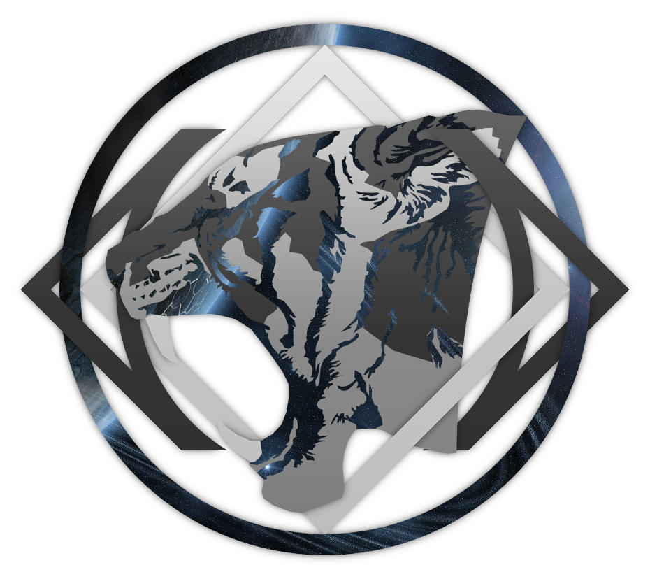
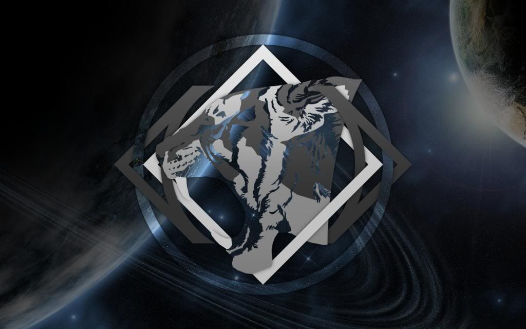
For 2014, I decided to clean up the tiger a bit. This new version looks almost exactly the same as the 2012/2013 tiger, but the jaggies and banding have been fixed. The emblem itself is solid metal this time instead of incorporating site elements, but there are also more variants and shadows have been added for depth.

gold.png
black.png
blue.png
green.png
red.png
white.png

Desktops will be available some time after Christmas, probably early next year. I currently have the following resolutions planned:
1280x1024
1280x800
1280x720
1600x1200
1680x1050
1920x1080

If you want a desktop with a non-listed resolution, just ask. They're pretty easy to add.
 
Last edited:

CABAL

<< ■ II ▶ >>
Staff member
Administrator
Star Navigator
Rogue AI technocrat
Joined
15 Aug 2009
Messages
3,511
Age
33
And now the ranks are done. And I made fancy charts. I may have gone overboard this year.

rank board.png
rank board pr.png
 
Last edited:

Majestic

Administrator
Staff member
Administrator
Seraphim Build Team
Joined
17 Apr 2006
Messages
18,310
Age
39
Those look awesome Cabal, some hard work has gone into those no doubt. :thumbsup:
 

Borg_Queen

Bringer of order to chaos
Joined
25 Apr 2006
Messages
4,831
Age
44
Wow, great looking emblems and ranks. And I can't wait for the desktops. :D
 

CABAL

<< ■ II ▶ >>
Staff member
Administrator
Star Navigator
Rogue AI technocrat
Joined
15 Aug 2009
Messages
3,511
Age
33
Finished the desktops earlier than I expected. Since there are thirty six total, here are previews at 1280x800 and download links for ZIPs with all resolutions of that color.

 
Last edited:

Majestic

Administrator
Staff member
Administrator
Seraphim Build Team
Joined
17 Apr 2006
Messages
18,310
Age
39
Those look awesome Cabal, really some fantastic work. One thing that bugs me a little and it's only my personal taste is how the tiger head just ends. Have you though of rounding it off at all or perhaps blurring it into the background?

Still great great these are awesome looking. :D
 

Rifraf

I know just enough to be a danger to myself
Joined
25 Aug 2013
Messages
1,221
Age
51
Those do look great Cabal. Think I like the red and black one's the most because the teeth stand out better against the white of the square in the background. Very cool
 

CABAL

<< ■ II ▶ >>
Staff member
Administrator
Star Navigator
Rogue AI technocrat
Joined
15 Aug 2009
Messages
3,511
Age
33
One thing that bugs me a little and it's only my personal taste is how the tiger head just ends. Have you though of rounding it off at all or perhaps blurring it into the background?
I may try those for the 2016 version, especially since I want to make the tiger bigger for 4k monitors. I can't really do it with the current tiger because my current master image is cut off just to the right of where the head ends in the current version. I've also already started work on the 2015 one and it's simply too complex to pull off a fade. I sketched it and confused myself. I'm also very proud of the addition of shadows to this year's emblem since they were tricky to do with the layering. I also think the illusion of depth helps a lot.

Those do look great Cabal. Think I like the red and black one's the most because the teeth stand out better against the white of the square in the background.
The red one is one of my favorites, too. I'm definitely going to aim for greater contrast with the teeth for future versions.

Anyway, to commemorate the newest version of MSFC, I have created a new variant of the 2014 tiger emblem. It's not a simple palette swap like the previous ones and incorporates the site's background image. I think you'll have to see it to understand. And so, I give you the Space Tiger.

space.png

1280x800.jpg

Desktop pack download link:
https://www.dropbox.com/s/z5cwvschr2ussf8/2014SpaceDesktops.7z

Huge props to the artist that did the MSFC v7 background. This wouldn't look nearly as good without it.
 

Majestic

Administrator
Staff member
Administrator
Seraphim Build Team
Joined
17 Apr 2006
Messages
18,310
Age
39
I noticed the new version a few days ago and it looks awesome mate. The wallpaper looks awesome as well. :thumbsup:
 

Terradyhne

Petty Officer 1st Class
Joined
19 Jan 2011
Messages
253
that emblem and desktop are so awesome, especially for me as i like cats the most of all animals and the tigers era the most majestic. :cool:
 

CABAL

<< ■ II ▶ >>
Staff member
Administrator
Star Navigator
Rogue AI technocrat
Joined
15 Aug 2009
Messages
3,511
Age
33
I noticed the new version a few days ago and it looks awesome mate. The wallpaper looks awesome as well. :thumbsup:

that emblem and desktop are so awesome, especially for me as i like cats the most of all animals and the tigers era the most majestic. :cool:
Thanks, guys. And I see what you did there, Terradyhne.:lol2:

I'm pretty happy with how the space one turned out, especially since I couldn't simply punch through the emblem for the desktop like I intended. The shadows, layers, and anti-aliasing all messed that up so I had to do some odd copy-paste stuff. I think I'll do more like that one in the future in addition to the palette swaps. If anybody has high-resolution pics of some woods or something they would like to donate I could easily tiger-ify them. More variety is always nice.
 

CABAL

<< ■ II ▶ >>
Staff member
Administrator
Star Navigator
Rogue AI technocrat
Joined
15 Aug 2009
Messages
3,511
Age
33
After I got my computer re-assembled but before the cable internet got hooked up, I did some work on the 2016 tiger, since I figured a tiger meant for emblems meant for a 4k resolution desktop would take some time. Turns out, I got it done in just a couple days so it's getting scaled down and incorporated into the 2015 emblem.

gold preview.png

I didn't do a fade out on the neck, like Majestic suggested, mostly because I don't know how to make the layering and shadows work well with one. I did make it more dynamic by having the ear extend past the cut off, though. I'm also thinking of having the ear go over a metal piece while the neck goes under.

There are a few more elements in this version, such as the beard thing (I hope that's a decent representation of what it looks like on a real tiger, I didn't have internet at the time), ear fluff, and gums (why do so many animals have black gums, anyway?). Some things that were on the same layer before, such as the stripes and nose, are on different layers now, which makes color adjustments of parts easier on me. The main outline, the border between the gold and silver sections, the beard, the white part of the ear, the fangs, the gums, and the nose were all done with the path tool to give them smoother edges. The stripes, on the other hand, were done with the lasso tool by hand, to give them a rougher look. I am considering doing a little more work on it because some of the stripes look a little too squiggly to me, but I'm open to suggestion and opinions.

The posted image and master file are at 1321 x 1238 pixels. While not 3840 x 2160, it is just part of the final image, which will be at the full 4k.

And now I have to go and re-upload the other pictures in this thread. I hope that doesn't take too long.
 

Majestic

Administrator
Staff member
Administrator
Seraphim Build Team
Joined
17 Apr 2006
Messages
18,310
Age
39
Looking great Cabal and it's great to have you back. Also great work on the Tiger icon.

An alternative to the fade could be making the neck section finish into a circle rather than a simple cut-off you could then incorporate it into the rings like in your avatar to show and continuous flow of the design.
 

CABAL

<< ■ II ▶ >>
Staff member
Administrator
Star Navigator
Rogue AI technocrat
Joined
15 Aug 2009
Messages
3,511
Age
33
Looking great Cabal and it's great to have you back. Also great work on the Tiger icon.
Thanks, Maj. I rather like being back.

An alternative to the fade could be making the neck section finish into a circle rather than a simple cut-off you could then incorporate it into the rings like in your avatar to show and continuous flow of the design.
That's an interesting idea. And it shouldn't interfere with the weave. I'll try it out and see how it goes.
 

Majestic

Administrator
Staff member
Administrator
Seraphim Build Team
Joined
17 Apr 2006
Messages
18,310
Age
39
I am interested to see how it works out for you. :D
 

CABAL

<< ■ II ▶ >>
Staff member
Administrator
Star Navigator
Rogue AI technocrat
Joined
15 Aug 2009
Messages
3,511
Age
33
For these next desktops, rather than doing every resolution I can think of, the plan is to do some common resolutions, ones that I'm using on my systems, and requests. Right now, I'm doing 1280x1024, 1280x800, 1280x720 (720p), 1360x768, 1920x1080 (1080p), and 3840x2160 (4k). Does anybody want a resolution that's not already in the list?

EDIT: I also intend to add some more special versions like the Space style. So far I've come up with Metro Tiger (Windows 8/10 flat style), iTiger (shiny monochrome Apple-like), P1 Tiger (monochrome green), and P3 Tiger (monochrome amber).
 
Last edited:

CABAL

<< ■ II ▶ >>
Staff member
Administrator
Star Navigator
Rogue AI technocrat
Joined
15 Aug 2009
Messages
3,511
Age
33
Here's the first of the 2015 tigers. Click for the absurdly high resolution version at 2805x1420.
gold.png
 

Majestic

Administrator
Staff member
Administrator
Seraphim Build Team
Joined
17 Apr 2006
Messages
18,310
Age
39
Very nice work Cabal. I really like the pattern/lines on the sides etc. :D
 

CABAL

<< ■ II ▶ >>
Staff member
Administrator
Star Navigator
Rogue AI technocrat
Joined
15 Aug 2009
Messages
3,511
Age
33
And now the other basic ones.
blue.png
red.png
green.png
white.png
black.png
I kind of wonder if the black one is perhaps a bit too black?

I'm also including the first special style, the Metro Tiger. It was the easiest to do. I tried to incorporate the Windows logo colors and this was the best I could figure out at the time. I think I have a better idea now, though. There's also a second one showing what color I'm thinking of for the Metro desktop.
metro.png
metro2.png

EDIT: And now I have a new Metro Tiger. I'm happier with this one. Now the Windows logo colors are on the \_ shaped things to evoke the Windows logo more.
metro3.png

An alternative to the fade could be making the neck section finish into a circle rather than a simple cut-off you could then incorporate it into the rings like in your avatar to show and continuous flow of the design.
I was thinking about this and I think I have a cool idea for next year. To the sketchbook!
 
Last edited:

Rifraf

I know just enough to be a danger to myself
Joined
25 Aug 2013
Messages
1,221
Age
51
I really like the white and the black is nice too. I don't think there's necessarily too much black except perhaps around the eye/ear area. Other than that I like it. :thumbsup:
 

CABAL

<< ■ II ▶ >>
Staff member
Administrator
Star Navigator
Rogue AI technocrat
Joined
15 Aug 2009
Messages
3,511
Age
33
Test for the 4k desktop. What do you think so far? Can't upload it here, apparently, so it's on Dropbox.

Warning: massive, 8.8MB
 

Hellkite

Lord of Death
Staff member
Administrator
Seraphim Build Team
Star Fighter
Joined
23 Apr 2006
Messages
7,647
test_zps5ctp2evh.png

^^ Nice work Cabal I hosted it for you on my Photobucket^^​
 

Majestic

Administrator
Staff member
Administrator
Seraphim Build Team
Joined
17 Apr 2006
Messages
18,310
Age
39
I really like that one Cabal. Great background to go with it. :D
 

CABAL

<< ■ II ▶ >>
Staff member
Administrator
Star Navigator
Rogue AI technocrat
Joined
15 Aug 2009
Messages
3,511
Age
33
I finally got the Metro pack done. The file sizes turned out much smaller than I expected. Maybe it's the flat colors?

Also, here's the 4k Space version. Since I scaled the background up from something that was close to 1080p, it kind of blurred a bit. Still nice, though.


Attachments

  • Metro2015.7z
    1,021.2 KB · Views: 4

Terra_Inc

MSFC's Cheshire Cat
Staff member
Site Manager
Necromancer/Troll hunter
Kitten Commander
Joined
16 Dec 2009
Messages
3,132
Age
34
Ooh, that's really cool! I might use that one when I have a widescreen monitor again. :shock:
 

CABAL

<< ■ II ▶ >>
Staff member
Administrator
Star Navigator
Rogue AI technocrat
Joined
15 Aug 2009
Messages
3,511
Age
33
Ooh, that's really cool! I might use that one when I have a widescreen monitor again. :shock:
Thanks! I actually managed to knock out the Space ones, too. Took me much less time than I expected, but I also didn't try to fit them as nicely as I did with the Metro versions.

Dropbox - Space2015.7z - 14.6mb
 

Terra_Inc

MSFC's Cheshire Cat
Staff member
Site Manager
Necromancer/Troll hunter
Kitten Commander
Joined
16 Dec 2009
Messages
3,132
Age
34
I just saw you made a 4:3 version of the space tiger. I'm already rocking it.
 

Attachments

  • screen.png
    screen.png
    1.6 MB · Views: 10

CABAL

<< ■ II ▶ >>
Staff member
Administrator
Star Navigator
Rogue AI technocrat
Joined
15 Aug 2009
Messages
3,511
Age
33
That looks an awful lot like my system. I've got Ubuntu 14.04 LTS. Which one do you have?
 

Terra_Inc

MSFC's Cheshire Cat
Staff member
Site Manager
Necromancer/Troll hunter
Kitten Commander
Joined
16 Dec 2009
Messages
3,132
Age
34
That looks an awful lot like my system. I've got Ubuntu 14.04 LTS. Which one do you have?
I switched to 15.04 when it was released. It's not much of a difference tbh, mostly updated software and kernel.
 
Top